Bar charts are used to display categorical data in rectangular bars either vertically or horizontaly. Bar charts help to understand categorical data with numeric values for each category. There are different type of bar charts for single or grouped categories to display. Plotly offers different functionalities to display bar charts with few lines of code.
Basic Bar Chart
Plotly has a set of example datasets that can be used for learning purpose to display different charts. We use gapminder data from plotly and display a basic chart. We can provide pandas dataframe, dictionary or an array like object.
import plotly.express as px
# get gapminder data for a single country
pak_data = px.data.gapminder().query("country == 'Pakistan'")
or if you want to use own data, we can create a Pandas DataFrame from custom list.
import pandas as pd
pak_data = pd.DataFrame([[1952, 41346560], [1957, 46679944], [1962, 53100671], [1967, 60641899], [1972, 69325921],
                   [1977, 78152686], [1982, 91462088], [1987, 105186881], [1992, 120065004], [1997, 135564834],
                   [2002, 153403524], [2007, 169270617]], columns=['year', 'pop'])
Now we can plot a bar chart using plotly. We provide x and y data column names for bar chart.
# For x and y, we provide column name from dataframe
fig = px.bar(pak_data, x='year', y='pop')
fig.show()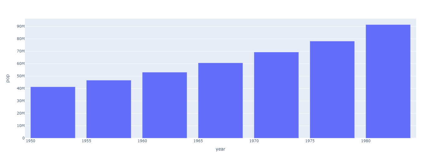
Grouped Bar Chart
if we have more than one category to plot, we can create a grouped bar chart with multiple categories for a x value. For example, for given years if we want to plot data for more than 1 countries in single bar chart, we can use plotly go module for this purpose and provide multiple columns.
import plotly.graph_objects as go

# List of data for each category
pakistan = [41346560, 46679944, 53100671, 60641899, 69325921]
germany = [69145952, 71019069, 73739117, 76368453, 78717088]
turkey = [22235677, 25670939, 29788695, 33411317, 37492953]

# Years
years = [1950, 1955, 1960, 1965, 1970, 1975, 1980]

# Create Bar charts
fig = go.Figure(data=[
    go.Bar(name='Pakistan', x=years, y=pakistan),
    go.Bar(name='Germany', x=years, y=germany),
    go.Bar(name='Turkey', x=years, y=turkey)
])
# Change the bar mode
fig.update_layout(barmode='group')
fig.show()
For this example we are providing lists of data instead from dataframe (But you can provide from both).
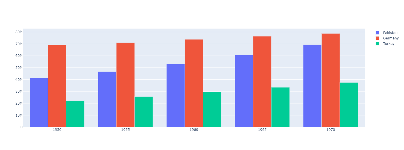
Now it shows data for 3 categories/countires for each years. We can add as much categories as we want but it will increase its width and column width will also decrease on default options.
Stacked BarChart
There is another option for displaying bar chart with multiple categories. We stack each category on top of other to create a stack for each group to create a stacked bar chart. It also helps to understand data and provides option for displaying more data for visualization.
In plotly, we dont need a lot of extra steps to create a stacked bar chart. We can use code above for grouped bar chart and can easily create a stacked barchart with one little modification. In fig.update_layout() method we change group to stack and it creates a stacked bar charts instead of grouped.
fig.update_layout(barmode='stack') # replace group width stack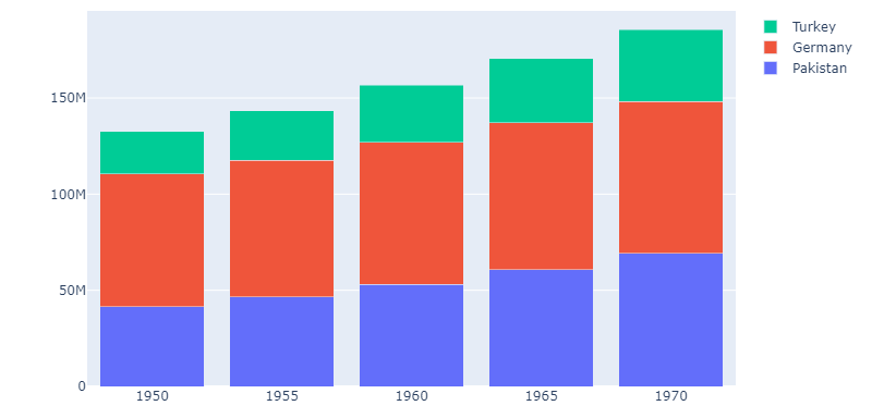
We can see that it is very easy to create bar charts using plotly with fewer lines of code. Lets take a look at further configurations.
Configure Barcharts
There are different configuration options available for changing behaviour of barcharts and data visualization.
Width and Height of chart
We can specify width and height for both methods to fix width and height of chart.
# using express
fig = px.bar(data_canada, x='year', y='pop', width=800, height=400)
# using graph objects
fig.update_layout(barmode='stack', width=800, height=400)
Specify Hover Data
We can also specify other columns from dataframe to show on hover when interacting with charts.
fig = px.bar(data_canada, x='year', y='pop', hover_data=["iso_alpha", "continent", "lifeExp"])When using graph objects, we need to specify another list of values for hover text.
fig = go.Figure(data=[
    go.Bar(name='Pakistan', x=years, y=pakistan, hovertext=["lifeExp: 43.43", "lifeExp: 45.55", "lifeExp: 47.67", "lifeExp: 49.8", "lifeExp: 51.92"]),
    go.Bar(name='Germany', x=years, y=germany, hovertext=["lifeExp: 67.5", "lifeExp: 69.1", "lifeExp: 70.3", "lifeExp: 70.8", "lifeExp: 71.0"]),
    go.Bar(name='Turkey', x=years, y=turkey, hovertext=["lifeExp: 43.58", "lifeExp: 48.07", "lifeExp: 52.09", "lifeExp: 54.33", "lifeExp: 57.00"])
])
As we can only specify a single value which is converted to string while showing data. But as it uses html and javascript to show charts, we can use string concationation and html tag for data processing and show multiple columns.
def get_hoverdata(country, columns):
  """ Returns list of strings consisting columns data """
  data = []
  for i, row in px.data.gapminder().query(f"country == '{country}'").iterrows():
    data.append("<br />".join([f"{col}: {row[col]}" for col in columns]))
  return data
Now we can modify code above to show multiple columns data
fig = go.Figure(data=[
    go.Bar(name='Pakistan', x=years, y=pakistan, hovertext=get_hoverdata("Pakistan", ['lifeExp', 'iso_num'])),
    go.Bar(name='Germany', x=years, y=germany, hovertext=get_hoverdata("Germany", ['lifeExp', 'iso_num'])),
    go.Bar(name='Turkey', x=years, y=turkey, hovertext=get_hoverdata("Turkey", ['lifeExp', 'iso_num']))
])
As we hover over any bar chart, it displays columns that we specified to each bar.
There are different other plotly bar chart examples and demos available on plotly website page. Check documentation and examples for more information for plotly bar charts here.