Bubble charts are a useful visualization tool that can help to represent data in a visually appealing and informative way. They are a variation of the traditional scatter plot, where each point is represented as a circle, or bubble, with the size of the bubble corresponding to the magnitude of a third variable. Plotly is a powerful data visualization library in Python that offers a wide range of interactive tools for creating various types of charts and graphs, including bubble charts. In this article, we will explore how to create interactive bubble charts using Plotly in Python.
Installing Plotly
Before we can start creating bubble charts, we need to install the Plotly library. We can do this using the following command:
pip install plotlyOnce we have installed Plotly, we can start exploring how to create bubble charts.
Creating Bubble Charts with Plotly
In Plotly, we can create a bubble chart using the scatter function. The scatter function allows us to specify the x, y, and size of the bubbles, as well as the color of each bubble. Here is an example of how to create a simple bubble chart using Plotly:
import plotly.graph_objects as go
import pandas as pd
# Create a sample dataframe
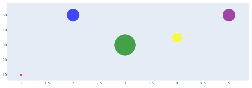
df = pd.DataFrame({'x': [1, 2, 3, 4, 5],
'y': [10, 50, 30, 35, 50],
'size': [10, 45, 75, 35, 45],
'color': ['red', 'blue', 'green', 'yellow', 'purple']})
# Create a bubble chart
fig = go.Figure(data=go.Scatter(x=df['x'],
y=df['y'],
mode='markers',
marker=dict(size=df['size'],
color=df['color'],
opacity=0.7)), layout=go.Layout(width=1000))
# Show the chart
fig.show()In this example, we first create a sample dataframe that contains the x, y, size, and color of each bubble. We then use the scatter function to create a bubble chart, specifying the x, y, and size of each bubble using the columns from the dataframe. We also set the mode to 'markers', indicating that each point should be represented as a bubble. Finally, we set the marker parameter to control the size, color, and opacity of each bubble.
When we run this code, we should see a bubble chart that looks like this:
This is a simple example, but we can use Plotly to create much more complex and interactive bubble charts.
Interactive Bubble Charts
One of the advantages of using Plotly is that it offers a wide range of interactive features that we can use to make our bubble charts more engaging and informative. Here are some examples of how we can add interactive features to our bubble charts where on hover we can show tooltips and also set custom colors for different categories.
We can also specify custom x and y range values for chart and also limit bubble size so that i does not exceed a specific size. We can create a custom chart using plotly express and add additional layout features like x, y and main title of chart and custom font size and family for a better custom look of chart.
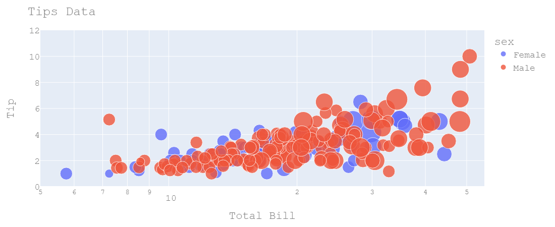
For this example, we use tips dataset from plotly which is by default available on plotly installation. Pandas installation is required for using dataframe in plotly and it is by default installed as plotly dependency, but you can also install using pip. Check example below with custom size, color and layout values.
import plotly.express as px

df = px.data.tips()

fig = px.scatter(df, x="total_bill", y="tip", size="size",
                 color="sex", hover_name="day",
                 log_x=True, size_max=30,
                 range_x=[5, 55], range_y=[0, 12])

fig.update_layout(
    xaxis_title="Total Bill",
    yaxis_title="Tip",
    title="Tips Data",
    font=dict(
        family="Courier New, monospace",
        size=18,
        color="#7f7f7f"
    ),
    width=1100, height=450/
)


fig.update_traces(marker_opacity=0.8)

fig.show()
In this example, we create a bubble chart using plotly express with additional inputs. px.scatter can be used to display a simple bubble chart with additional parameters like color, size and custom ranges for axis. Then we can provide a custom layout data using fig.update_layout and provide custom titles, font and size of chart. Check the output below for this code example.
Adding Dropdown Menus
We can also add custom dropdown menu as filter for any column in dataframe and show respective data. This involves further work with DataFrame to filter and get unique values for that specific column. In this example, we will use time column which contains two values Lunch and Dinner. So we can add a dropdown filter, where we can select a specific time or view all data by default. Check code below that how we can implement this using plotly.
import plotly.graph_objs as go
import pandas as pd

fig = go.Figure()

# iterate on unique values and get for that specific time
for time in df['time'].unique():
    df_time = df[df['time'] == time]
    # add scatter plot
    fig.add_trace(
        go.Scatter(
            x=df_time["total_bill"], y=df_time["tip"],
            mode='markers', name=time,
            marker_size=df_time['total_bill'],
            hovertemplate='%{text}

' +
                        'Bill: %{x:,}
' +
                        'Tip: $%{y:,.0f}
',
                         text=df_time['time']))

# Get unique values for time column
times = df['time'].unique()
buttons = []
for time in times:
    visible = [False] * len(times)
    visible[list(times).index(time)] = True
    # add button for each time (Lunch and Dinner) to buttons list
    buttons.append(dict(method='update',
                        label=time,
                         args=[{'visible': visible},
                               {'title': f'{time}'}]))

# update layout to add dropdown button
fig.update_layout(
    updatemenus=[dict(type='dropdown',
                      showactive=True,
                      buttons=buttons,
                      x=0.1, y=1.15)],
    title=dict(text='Lunch and Dinner', x=0.5, y=0.9, xanchor='center', yanchor='top'),
    xaxis_title="Total Bill", yaxis_title="Tip"
)

# show figure
fig.show()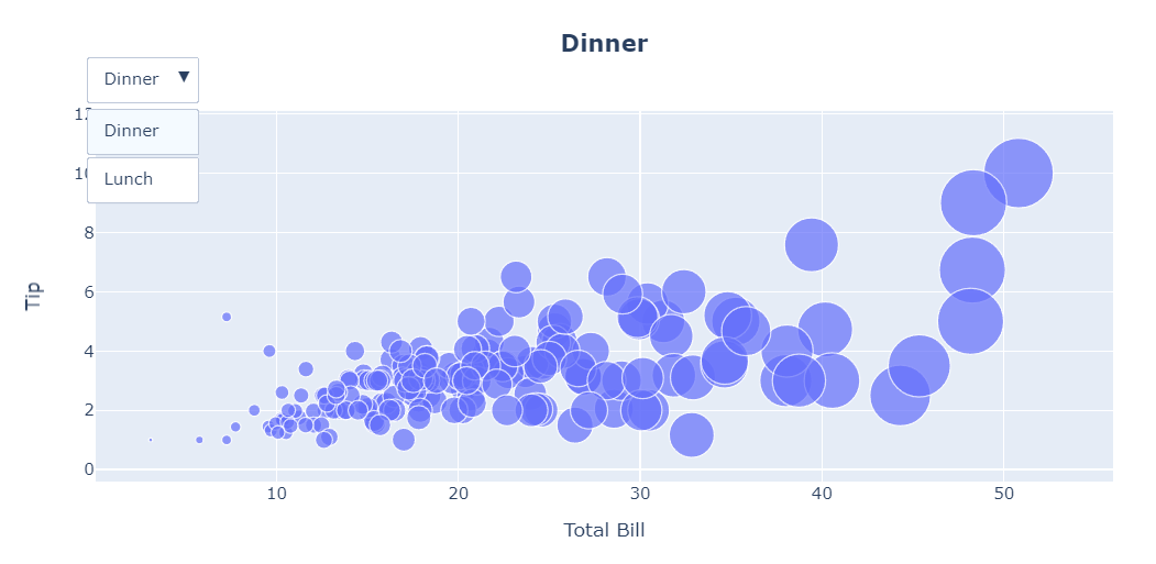
In this example, we create a bubble chart using plotly graph_objects, with additional inputs. go.Scatter can be used to display a simple bubble chart with additional parameters marker_size, hovertemplate etc. Then we can create a unique list of filters and create button for each unique filter, which later on is added to figure using fig.update_layout in update_menus parameters. We can also set title and axis tiltles for x and y axis. The resulting figure is interactable and we can select time between Lunch and Dinner and view respective data.
For more information on bubble charts using plotly, visit official plotly documentation.