 article
Create interactive line charts using plotly in python
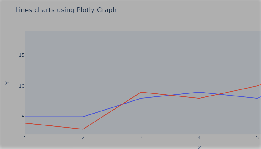
Plotly Line chart is commonly used in data visualization is a line chart, which can be used to display trends and changes in data over time or across different categories.
articlePlotly Line chart is commonly used in data visualization is a line chart, which can be used to display trends and changes in data over time or across different categories.
 article
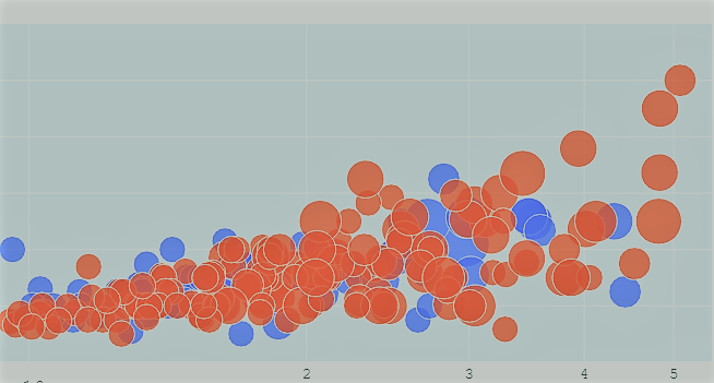
Create interactive bubble charts with custom filters and menu to filter selected data and custom configurations.
 article
Create a heatmap and confusion matrix, including how to format the data, customize the color scheme, and add annotations. Get step-by-step instructions to help readers create their own visualizations in Python using Plotly.
 article
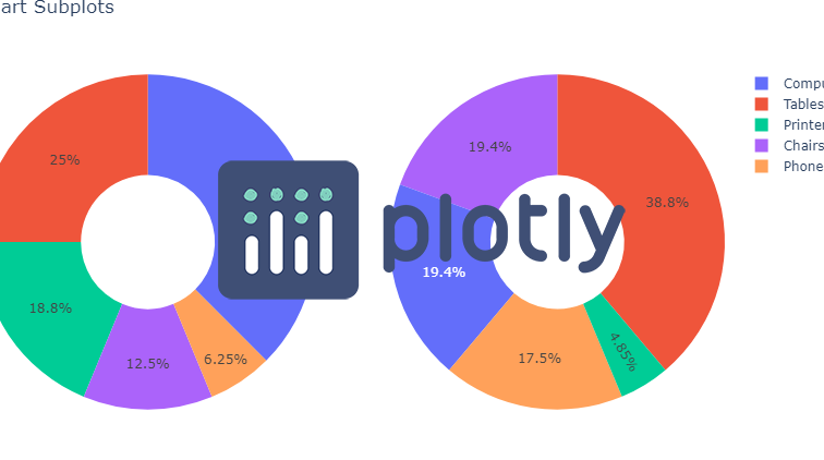
Create Interactive Pie and Donut charts using Plotly with plotly express and plotly figure. Also add different data and chart viewing options.
 post
postCreate Interactive Box plots easily using plotly and pandas in python with fewer line of code.
 post
postPose estimation using mediapipe in images and videos with person segmantation and draw landmarks on images or apply person segmentation using python
 post
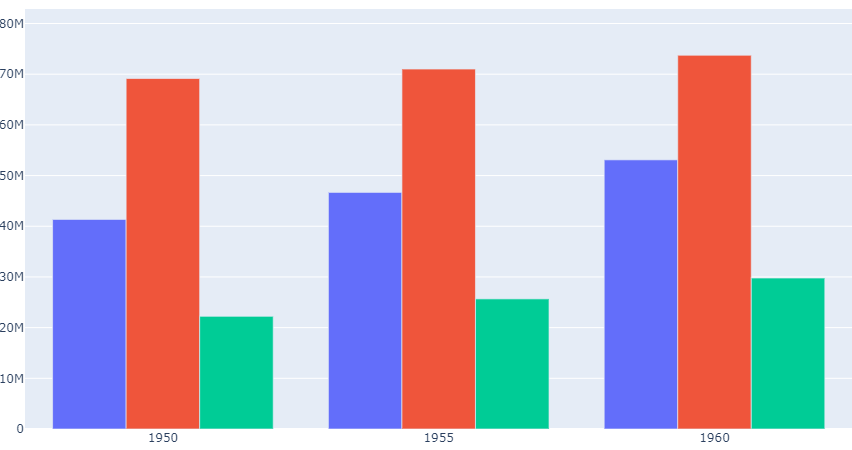
postCreate interactive bar charts using plotly and customize behaviour to create grouped, stacked and single bar char charts and show data on interaction.
 post
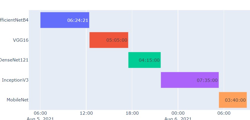
postUse plotly python data visualization tool for create gantt or timeline charts for different type of data like date and time and different visualization options for modifing chart and its views.