Plotly is a Python library for creating interactive plots. We can create different types of plots using Plotly. In this tutorial, we will learn how to create interactive Pie Charts using Plotly.
A Pie Chart is a circular statistical graphic, which is divided into slices to illustrate numerical proportion. It is very useful for showing the composition of different categories in a dataset. In a Pie Chart, the arc length of each slice (and consequently its central angle and area), is proportional to the quantity it represents. We can create Pie charts to show the percentage or proportional data distribution in different categories.
Creating a Pie Chart using Plotly is very simple. First, we need to install Plotly using the following command:
python
pip install plotlyWe can create a Pie Chart using the go.Pie() function. The go.Pie() function takes the following arguments:
- labels: It is a list of strings that specifies the labels of the slices.
- values: It is a list of numbers that specifies the values of the slices.
- name: It is a string that specifies the name of the Pie Chart.
- title: It is a string that specifies the title of the Pie Chart.
For more details on arguments, check documentation.
Now, first we create a sample DataFrame and create basic Pie charts using plotly.
python
# importing the required libraries
import plotly.express as px
import pandas as pd

# create a dataframe
df = pd.DataFrame({
        'x': ['a', 'b', 'c', 'd', 'e'],
        'y': [143, 822, 367, 500, 245]
    })

# create a figure
fig = px.pie(df, values='y', names='x')

# show the figure
fig.show()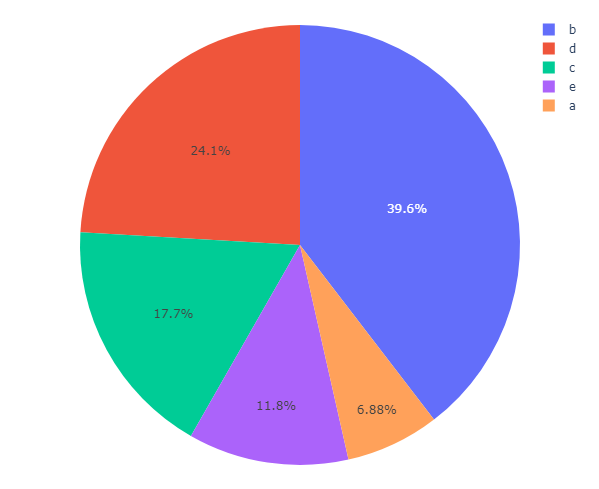
We can also define the colors of the slices in the pie chart. For this, we need to pass the color parameter in the Pie function. We can also specify
list, dict or colors from plotly express.
python
pie = px.pie(df, values='y', names='x', color='x')

# or specify the color_discrete_sequence parameter to define the colors of the slices.
pie = px.pie(df, values='y', names='x', color_discrete_sequence=['red', 'green', 'blue', 'yellow', 'orange'])

# or we can also pass the color_discrete_map parameter to define the colors of the slices using a dictionary.
pie = px.pie(df, values='y', names='x', color_discrete_map={'a': 'red', 'b': 'green', 'c': 'blue', 'd': 'yellow', 'e': 'orange'})

# or we can also pass the color_discrete_map parameter to define the colors of the slices from plotly.express.colors.sequential.
pie = px.pie(df, values='y', names='x', color_discrete_sequence=px.colors.sequential.Blugrn)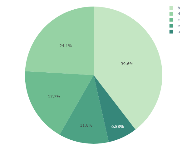
python
pie = px.pie(df, values='y', names='x', color='x',
        hover_data=['y'], title='Pie Chart', hover_name='x')
We can show additional information in the pie chart by passing the hover_data parameter and also set title and labels using the title and labels parameters.
Pie charts can also be used to show in donut charts by passing the hole parameter. The hole parameter defines the size of the hole in the donut chart.
python
pie = px.pie(df, values='y', names='x', hole=0.7)

pie.show()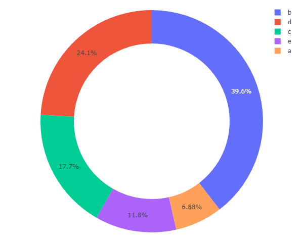
Plotly Go Figure
We can also create a Pie Chart using the go.Figure() function. The go.Figure() function takes the following arguments:
- data: It is a list of traces that specifies the data of the Pie Chart.
- layout: It is a dictionary that specifies the layout of the Pie Chart.
Now, let's create a Pie Chart using the
go.Figure() function.
python
import plotly.graph_objects as go

labels = ['Chairs', 'Tables', 'Computers', 'Printers', 'Phones']
values = [10, 20, 30, 15, 5]

fig = go.Figure(data=[
        go.Pie(labels=labels, values=values)
    ])

# displaying the Pie Chart
fig.show()
We can pull out a sector of the pie chart by passing the pull parameter in the Pie function.
python
fig = go.Figure(data=[go.Pie(labels=labels, values=values, pull=[0, 0.05, 0, 0, 0])])
fig.show()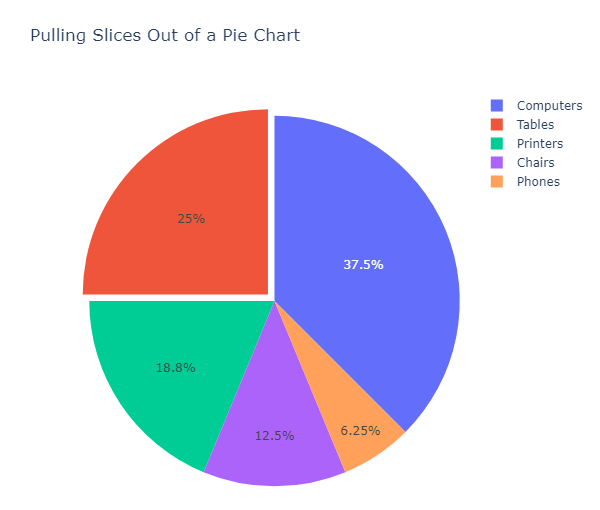
We can show multiple pie charts in a single figure by passing the domain parameter in the Pie function.
python
from plotly.subplots import make_subplots

fig = make_subplots(rows=1, cols=2, specs=[[{'type':'domain'}, {'type':'domain'}]])

# add both charts to figure
fig.add_trace(go.Pie(labels=labels, values=values, name="Pie Chart 1"),
                1, 1)
fig.add_trace(go.Pie(labels=labels, values=[20, 40, 20, 5, 18], name="Pie Chart 2"),
                1, 2)
# make donut chart
fig.update_traces(hole=.4, hoverinfo="label+percent+name")

fig.show()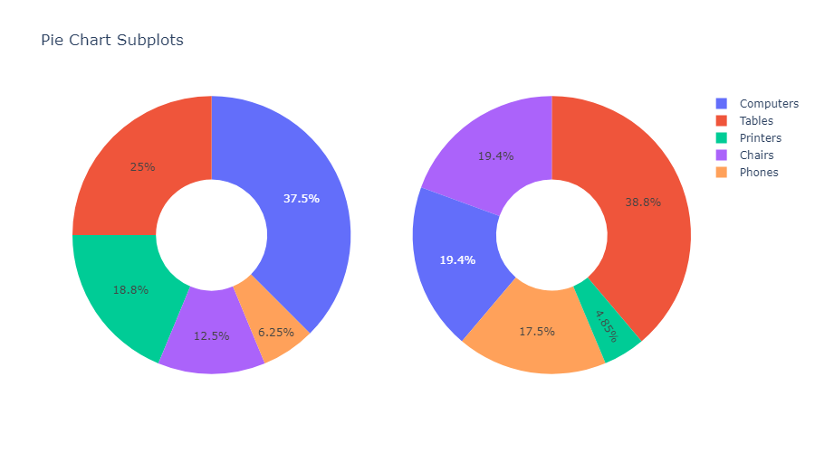
There are many other parameters that we can use to customize the pie chart. For more information, visit the official documentation of plotly.express.
Conclusion
In this tutorial, we learned how to create a pie chart in Python using plotly.express and plotly.graph_objects. We also learned how to customize the pie chart by passing different parameters in the Pie function.
For more information, visit the official documentation of plotly.express and plotly.graph_objects.