Data visualization is a crucial aspect of data analysis and machine learning. Heatmaps and confusion matrices are widely used visualization tools in data analysis and machine learning. Plotly is a popular open-source library that provides interactive and dynamic visualization capabilities in Python. In this article, we will discuss how to create a heatmap/confusion matrix using Plotly in Python.
Heatmap and Confusion Matrix
A heatmap is a graphical representation of data that uses color-coded cells to represent the values of a two-dimensional matrix. Heatmaps are commonly used to visualize large datasets with a color scale, where colors correspond to the values of the matrix.
A confusion matrix is a table used to evaluate the performance of a classification algorithm. The matrix compares the predicted values of the algorithm against the actual values and displays the number of correct and incorrect predictions in each class.
Creating a heatmap/confusion matrix
To create a heatmap/confusion matrix in Plotly, we need to install required python package. If you have python installed, install the library using the following command in terminal/cmd.
pip install plotlyOnce the library is installed, we can import it in our Python code using the following code and start working.
import plotly.graph_objs as goCreating a heatmap
To create a heatmap, we first need to create a two-dimensional matrix of values. We can use the go.Heatmap() function to create the heatmap. The go.Heatmap() function takes the following arguments:
- z: a two-dimensional matrix of values
- x: an array of x-axis labels
- y: an array of y-axis labels
- colorscale: a color scale for the heatmap
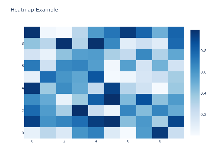
Here's an example code to create a heatmap:
import plotly.graph_objs as go
import numpy as np

# create a two-dimensional matrix of values
z = np.random.rand(10, 10)

# create the heatmap
heatmap = go.Heatmap(z=z, colorscale='Blues')

# create the layout
layout = go.Layout(title='Heatmap Example')

# create the figure
fig = go.Figure(data=[heatmap], layout=layout)

# show the figure
fig.show()
In the code above, we first create a two-dimensional matrix of random values using the numpy library. We then create the heatmap using the go.Heatmap() function and provide the matrix of values and a color scale. We also create a layout and a figure using the go.Layout() and go.Figure() functions. Finally, we show the figure using the show() function.
Creating a confusion matrix
Same as heatmap, we need to create a 2D matrix which we can then provide to heatmap. In this exmaple, we have predicted and actual labels for 2 classes (0 and 1). Now first we need to calculate confusion matrix. We are using sklearn library for this which provides a confusion matrix for 2 list of equal labels values. It returs a 2D matrix of shape (n, n) where n is equal to total number of classes in labels list.
Now, we can provide that 2D matrix to plotly for visualization. Here we also provide X and Y axis labels, which are list of our classes.
import plotly.graph_objs as go
import numpy as np
from sklearn.metrics import confusion_matrix

# create the actual and predicted labels
actual_labels = [1, 0, 0, 1, 0, 0, 1, 0, 1, 0, 0, 1, 0, 1, 0, 0, 1, 1, 1, 1]
predicted_labels = [1, 0, 0, 1, 0, 0, 1, 0, 1, 0, 0, 1, 0, 1, 0, 0, 0, 1, 1, 0]

# create the confusion matrix
cm = confusion_matrix(actual_labels, predicted_labels)

# create the heatmap
heatmap = go.Heatmap(z=cm, x=['0', '1'], y=['0', '1'], colorscale='Blues')

# create the layout
layout = go.Layout(title='Confusion Metrix')

# create the figure
fig = go.Figure(data=[heatmap], layout=layout)

# show the figure
fig.show()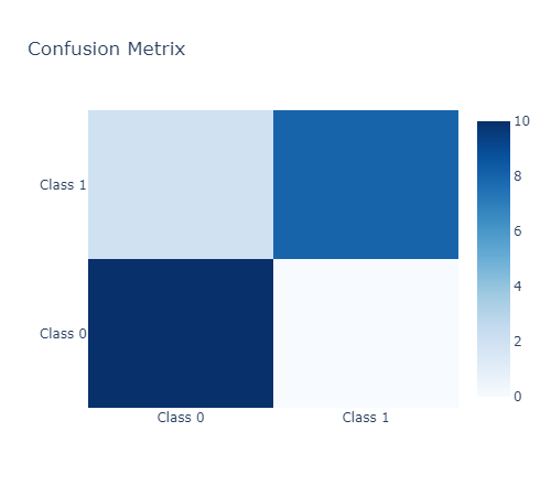
Confusion Matrix for multiple classes
Confusion matrix is a very useful tool for evaluating the performance of a machine learning model. It allows you to see how well your Machine Learning model is doing in terms of predicting the correct class for each data point.
In this article, we will use the MNIST dataset to demonstrate how to create a confusion matrix using Plotly and Scikit-learn.
The MNIST dataset is a set of 70,000 images of handwritten digits from 0 to 9. Each image is 28x28 pixels, and there are 60,000 training images and 10,000 test images. We will use the Scikit-learn library to train a support vector machine (SVM) model on the MNIST dataset and then create a confusion matrix using Plotly.
First, we need to import the necessary libraries and load the MNIST dataset. We will also split the data into training and testing sets.
import plotly.graph_objs as go
import plotly.offline as pyo
from sklearn import datasets, svm, metrics
from sklearn.model_selection import train_test_split

# Load the MNIST dataset
digits = datasets.load_digits()

# Split the data into training and testing sets
X_train, X_test, y_train, y_test = train_test_split(digits.data, digits.target, test_size=0.2, random_state=42)
Next, we will train the SVM model on the training data and make predictions on the testing data.
# Train the SVM model
clf = svm.SVC(gamma=0.001, C=100.)

# Fit the model to the training data
clf.fit(X_train, y_train)

# Make predictions on the testing data
y_pred = clf.predict(X_test)
Now that we have our predictions, we can create a confusion matrix using Plotly. We will use the confusion_matrix function from Scikit-learn to generate the matrix and then create a heatmap using Plotly.
# Generate the confusion matrix
cm = metrics.confusion_matrix(y_test, y_pred)

# Define the layout for the heatmap
layout = go.Layout(
    title="Confusion Matrix",
    xaxis=dict(title="Predicted Label"),
    yaxis=dict(title="True Label")
)

# Create the heatmap trace
trace = go.Heatmap(z=cm, x=list(range(10)), y=list(range(10)), colorscale="Viridis")

# Create the figure and plot it
fig = go.Figure(data=[trace], layout=layout)
fig.show()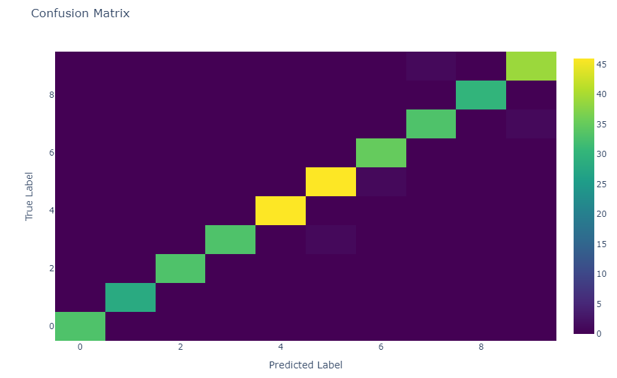
The confusion matrix shows how well our SVM model is doing at classifying the digits in the MNIST dataset. The rows represent the true labels, and the columns represent the predicted labels. The diagonal elements represent the number of correctly classified data points, while the off-diagonal elements represent the number of misclassified data points.
Plotly is a powerful and flexible library for creating visualizations in Python. Using the go.Heatmap() function, we can create confusion matrices that are easy to interpret and can help us understand the performance of our classification models. For more details, read plotly documentation or view further heatmap and confusion matrix examples.