Data visualization is an essential aspect of data analysis. Python offers a wide range of libraries for data visualization, and Plotly is one of them. Plotly is a powerful data visualization library that provides interactive plots, charts, and graphs. In this article, we will explore how to create interactive line charts using Plotly in Python.
Installation
Before we start creating line charts using Plotly, we need to install the Plotly library. We can install Plotly using pip, a package manager for Python.
pip install plotlyOnce installed, we can use plotly to create interactive charts.
Basic Line Chart
A line chart is a graph that displays data as points connected by a line. It is commonly used to show trends over time. In Plotly, we can create line charts by using the go.Scatter class.
import plotly.express as px

# random data
x_data = [1, 2, 3, 4, 5, 6, 7, 8]
y_data = [10, 8, 6, 4, 12, 25, 35, 40]

# create a simple line chart
fig = px.line(x=x_data, y=y_data)

fig.show()
In the above code, we first import the necessary libraries. Then, we define the x-axis and y-axis data as two lists. We create a px.line object with the x and y data and set the mode to lines to create a line chart. Finally, we used fig.show() to show output chart.
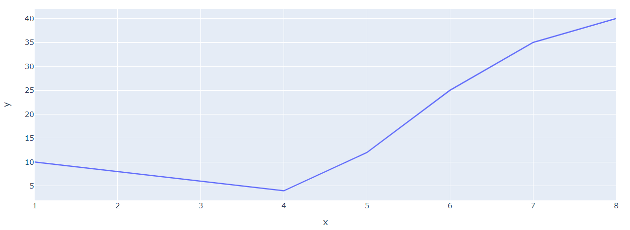
In above image, we can see a simple line drawn using plotly. Now, we can also add multiple lines.
Line Chart with Markers and Metadata
To show metadata and markers in our line chart, we can use the marker parameter and set it to True. Let's modify the code from the previous example and add markers to our chart.
import plotly.express as px
x_data = [1, 2, 3, 4, 5, 6, 7, 8]
y_data = [10, 8, 6, 4, 12, 25, 35, 40]

fig = px.line(x=x_data, y=y_data, width=1100, markers=True, title='Simple Line chart with Markers')

fig.show()
In above code, we set markers to true and it shows a simple marker for each data point.
Date Axis Line Plots
If we have date axis that we want to show along side x-axis, we can also show that data. For this example, we create a custom pandas DataFrame object with custom dataset and we can show a simple Line plot with date x-axis.
import plotly.graph_objs as go
import pandas as pd

# create a sample dataframe with datetime index and custom data
data = {'date': ['2022-01-01', '2022-02-01', '2022-03-01', '2022-04-01', '2022-05-01',
                 '2022-06-01', '2022-07-01', '2022-08-01', '2022-09-01', '2022-10-01'],
        'value': [10, 20, 30, 40, 50, 45, 60, 65, 64, 70]}
df = pd.DataFrame(data)
df['date'] = pd.to_datetime(df['date'])

# line with markers
line = px.line(df, x='date', y='value', markers=True, title='Line Chart with Datetime Axis and Custom Data')


line.show()
This code creates a line chart with a datetime x-axis using a sample dataframe with custom data. The pd.to_datetime() function is used to convert the date strings into datetime objects. After that we can pass pandas dataframe to line object of plotly express and can show a line plot with markers.
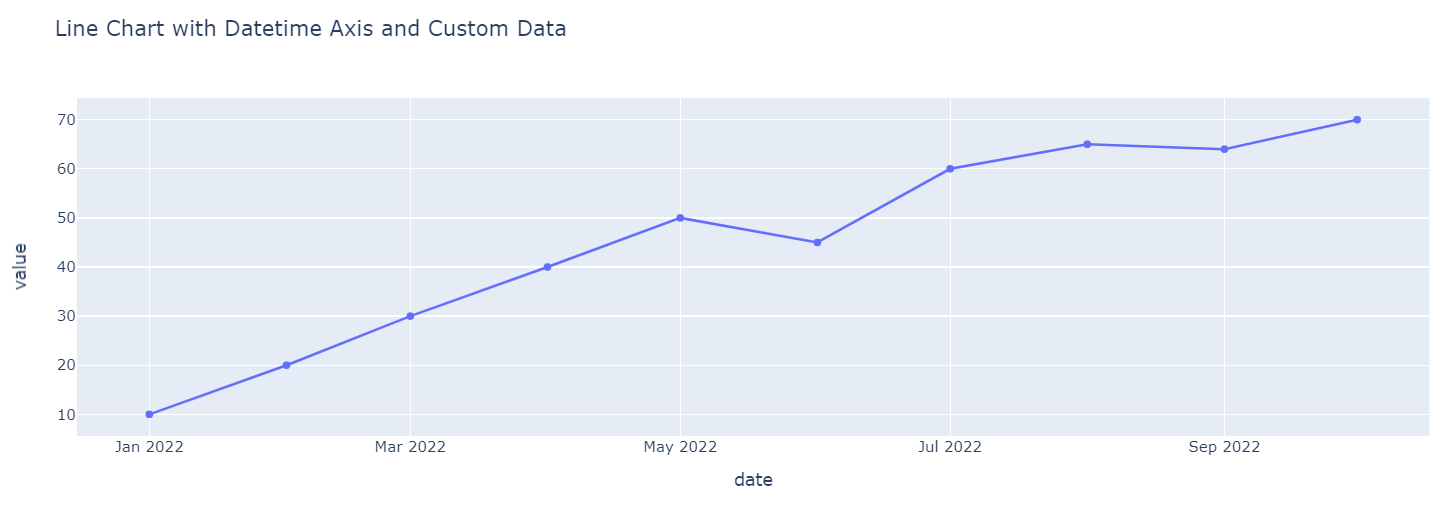
As we can see in above example, it shows a number of x-axis date values in formatted way for easy visualization and understanding. In next example, we learn how to add multiple lines to chart using plotly graph objects.
Adding Multiple Lines
We can add multiple lines to a line chart by creating multiple go.Scatter objects and appending them to the trace list.
import plotly.graph_objs as go

x_data = [1, 2, 3, 4, 5, 6, 7]
y_data_1 = [5, 5, 8, 9, 8, 12, 15]
y_data_2 = [4, 3, 9, 8, 10, 14, 18]

trace_1 = go.Scatter(x=x_data, y=y_data_1, mode='lines', name='Line 1')
trace_2 = go.Scatter(x=x_data, y=y_data_2, mode='lines', name='Line 2')

fig = go.Figure([
    trace_1, trace_2
])
fig.update_layout(
    title = 'Lines charts using Plotly Graph',
    width = 1100,
    xaxis_title = 'X',
    yaxis_title = 'Y'
)

fig.show()
In the above code, we create two go.Scatter objects with different y-axis data and names. We add both the traces to the data list and generate the line chart.
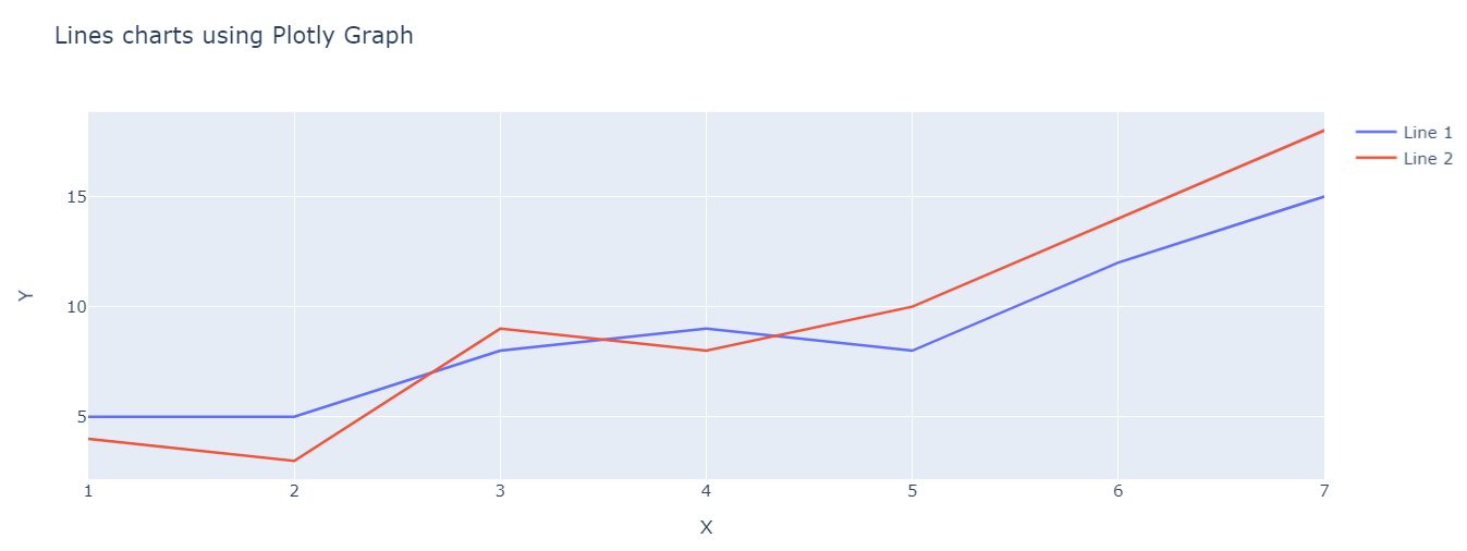
This shows 2 lines with seperate colors. We can also show markers with these lines with mode lines+markers value. Plotly offers a lot of way to interact and show data in line charts. We have shown a couple of example in this article. For more info and example on creating line charts with plotly, visit official page of plotly website for all examples.